
A Rosa, Plant Medicine
Client: A Rosa, Plant Medicine
Industry: Beauty | Skincare
Service: StrategicRebrand | Packaging | Social Media
THE STORY
A Rosa Plant Medicine is an organic skincare line founded by Agnieszka Machnacz—a Polish folk pharmacist based in Santa Fe, New Mexico. Rooted in Polish herbal traditions and crafted with locally sourced, 100% organic ingredients, the brand reflects her deep belief in nature’s ability to restore and make us whole.
A Rosa represents the transformation of her knowledge and passion into intentional formulations designed to support healing, self-connection, and a return to inner wisdom.

THE CHALLENGE
For this rebrand, the challenge was to transform a previously minimal label system into a cohesive visual identity, developing a new logo and packaging that reflected the client’s vision of a soft, feminine aesthetic rooted in watercolor expression.


THE SOLUTION
The solution emerged with clarity, as the client’s vision was both well-defined and deeply aligned with the brand’s essence. With this strong foundation, the process flowed naturally into exploration: sketching, watercolor studies, and typographic refinement.
This clarity allowed for a more intuitive and expressive creative process, where I could fully explore the language of watercolor roses and develop a typographic system that embodied a soft, feminine sensibility. The result was a thoughtful and cohesive identity shaped through both intention and experimentation.


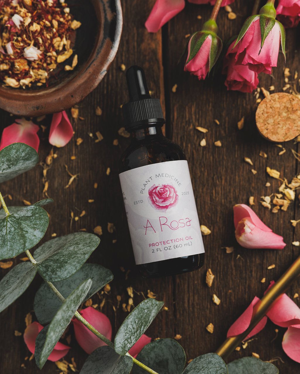
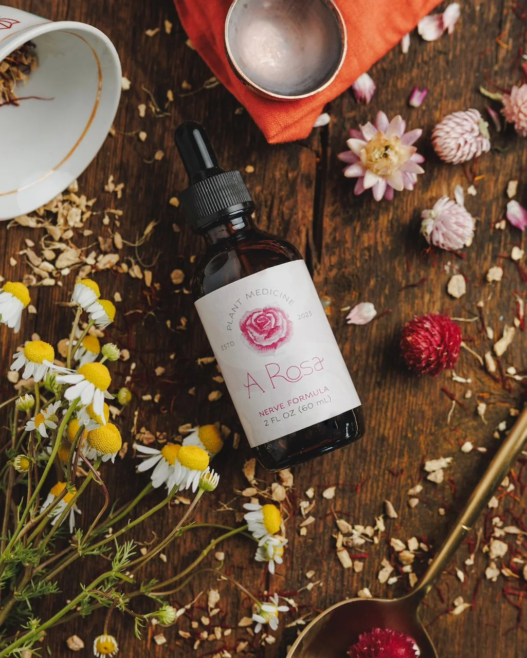
FINAL LOGO


After finalizing the new logo and identity for the brand, the project progressed to the development of labels for a wide range of products. Each product held significant value in its representation of the medicinal properties of various herbs and plants studied by the brand. To maintain consistency with the established visual identity, I opted for a design solution that seamlessly integrated with the brand's aesthetic. This led to the creation of a subtle rose pattern, chosen for its ability to serve as a background element without overshadowing the primary product information.


Despite the extensive list of products, the client opted for a standardized pattern and layout, allowing for streamlined production and a cohesive brand presence across all items. By carefully balancing hierarchy and contrast, I ensured that the essential product information remained prominent while still incorporating the rose pattern harmoniously. This design approach not only adhered to the client's specifications but also enhanced the overall brand identity. The finalized labels serve as a testament to the brand's commitment to quality and authenticity, effectively conveying the essence of each product to consumers.