THE STORY
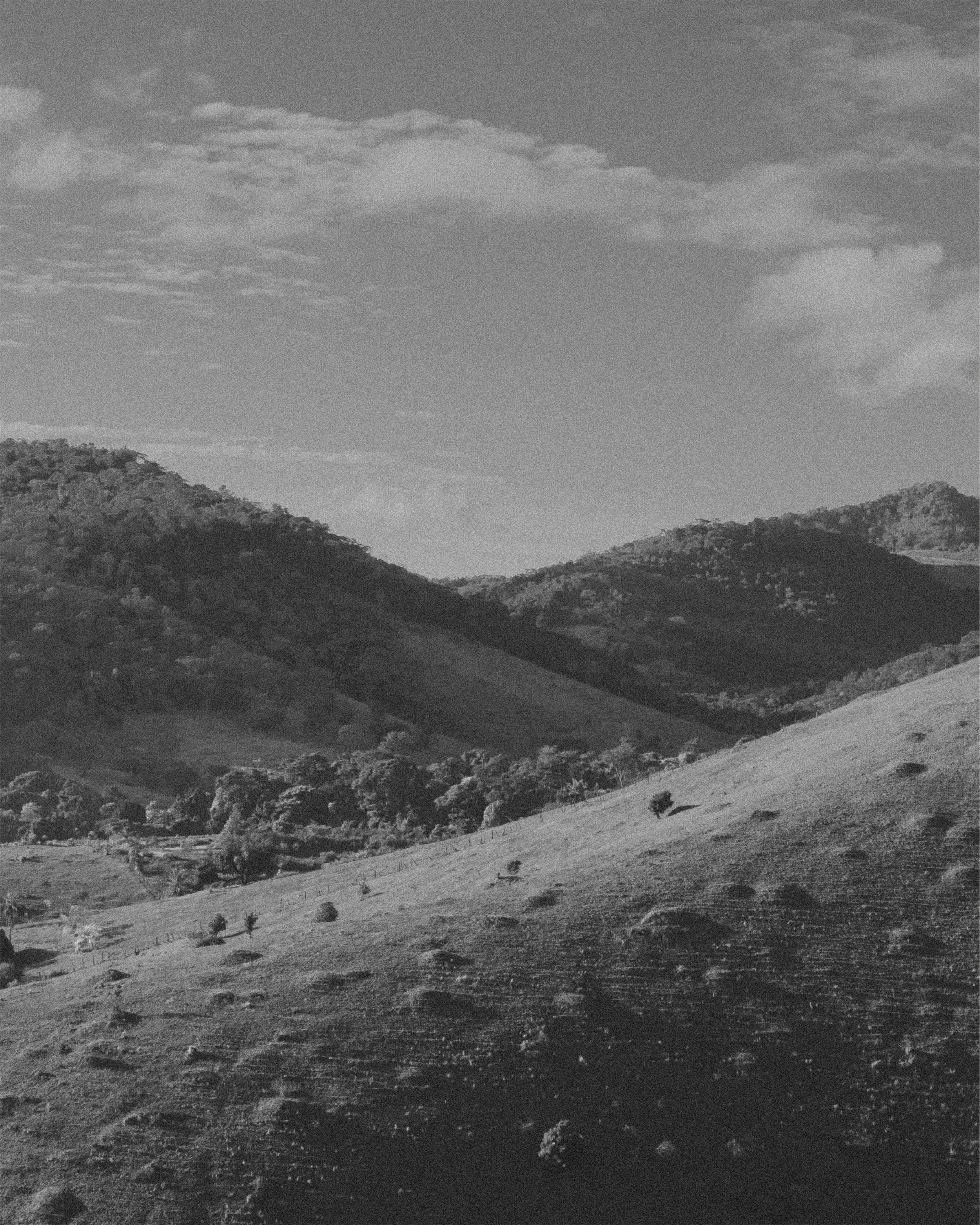
Casa Angatu is a hotel located in the countryside of Minas Gerais, a state known by its beautiful mountainous landscape, great food, and warm people. It is a place where exchange and connection are at the core of its existence. Here, experiences and contact with nature provide a safe space where guests can leave feeling better than when they arrived. Their mission is to provide the necessary resources — even if that just means a cozy cabin surrounded by nature — for people who want to develop themselves through retreats or by working silently with their own minds.


THE CHALLENGE
Experience tourism is something highly sought after nowadays, and the possibilities of travel, retreats, and places to immerse oneself in new experiences and cultures are numerous. The challenge then was how to naturally highlight the beauty of the space, its mountains, the unmistakable flavor of the food, and the memorable experiences that guests can have in this boutique hotel of such comfort and warmth compared to all other competing accommodations.
Besides the competition part, the name of the boutique hotel was another challenge to unfold. The word 'Angatu' comes from the Tupi-Guarani, one of the oldest indigenous groups in Brazil, and it means 'well-being'. Due to its origins, the initial idea when working on the logo and identity was to reflect its indigenous roots in the brand's visuals.
THE SOLUTION
After we abandoned the geometric shapes and indigenous symbols, we started to “look around”. The village where the boutique hotel is located, São Gonçalo do Bação, is a small town with simple people and vibrant nature. The mountains that surround the village are beautiful and one of the main characteristics of the region.
However, after sketching some symbols and discussing the 'Angatu' concept further with the owners, we realized that it wouldn't make sense to pursue this approach since there was no direct connection between the hotel and indigenous people.
The word 'Angatu' is used in various contexts and is not solely related to tribes. Therefore, we decided to abandon the geometric shapes and symbols associated with Tupi-Guarani culture. Instead, we focused on the meaning of the word and aimed to develop something that captured the essence of the city where the hotel is located, São Gonçalo do Bação.
Based on that, the design was thought to reflect the horizontal curves seen everywhere in the lush green land. The organic shapes are also a feature thought to represent the fluid and natural process guests can experience staying at Casa Angatu.

FINAL LOGO


Design & Strategy: Vitoria Oliveira
Icons: Henrique Farage
