

IntraAct Brasil
Client: IntraAct Brasil
Industry: Education — Evidence-Based Literacy Systems
Service: Rebrand & Visual Identity
THE STORY
IntraAct is a highly effective literacy teaching method grounded in cognitive neuroscience, originally developed in Germany by psychologists Fritz Jansen and Uta Streit.
The methodology translates into practice what the National Reading Panel identified as the five essential pillars of successful reading instruction: phonemic awareness, systematic phonics, reading fluency, vocabulary development, and reading comprehension.
As the method expanded internationally, it was introduced to Brazil, where it is now implemented in schools across the country through its local affiliate, IntraAct Brasil—bringing structured, evidence-based literacy education into a new cultural context.
THE CHALLENGE

The objective was to design a logo and visual identity that honored the integrity of the original German brand while establishing a distinct presence for the Brazilian market.
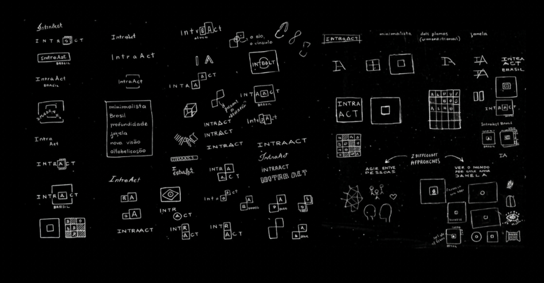
This required a careful balance: preserving recognizability and trust associated with the established methodology, while introducing warmth, accessibility, and cultural relevance. An additional layer of the challenge was to visually reference one of the method’s core teaching tools (the “little square,” used to isolate and guide children’s focus on one letter at a time). This element needed to be subtly embedded into the identity in a way that felt intentional, not literal.
THE SOLUTION
The solution emerged through a strategic balance of continuity and localization.
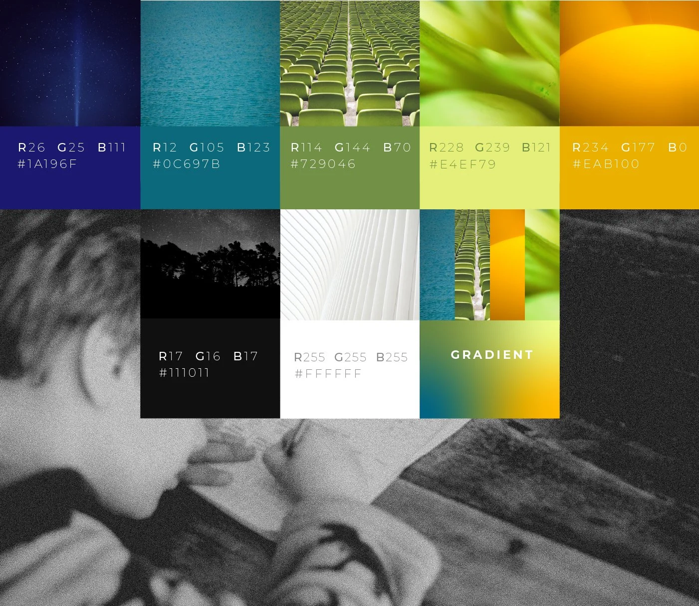
We retained the geometric foundation of the original identity, ensuring alignment with the German roots and maintaining a sense of structure, clarity, and educational rigor. From there, we expanded the system into a more expressive visual language tailored to Brazil. A vibrant yet harmonious color palette with lush greens, warm yellows, and deep blues, was introduced to evoke the Brazilian landscape and cultural identity, drawing inspiration from elements such as the national flag, tropical nature, and the country’s characteristic light.

LOGO IN GERMANY

LOGO IN BRAZIL
The “square” concept was reinterpreted as a modular design element within the identity system, subtly referencing the methodology’s teaching approach while also enabling flexibility across applications.
The result is a cohesive visual ecosystem that feels both grounded in its origins and alive within its new context: bridging science, education, and culture through design.
LOGO VARIATIONS