
Leme Languages
Client: Leme Languages
Industry: Consulting & Professional Services
Service: Signature & Web | + Naming
THE STORY
Leme Languages is a human-first, AI-supported translation and interpretation company based in South Florida, United States. Founded by the couple Vitória and Gabriel Leme, the company is deeply rooted in lived immigrant experience. They know firsthand what it means to translate critical documents, navigate the uncertainty of government interviews, and face high-stakes moments in a language that isn’t your own.
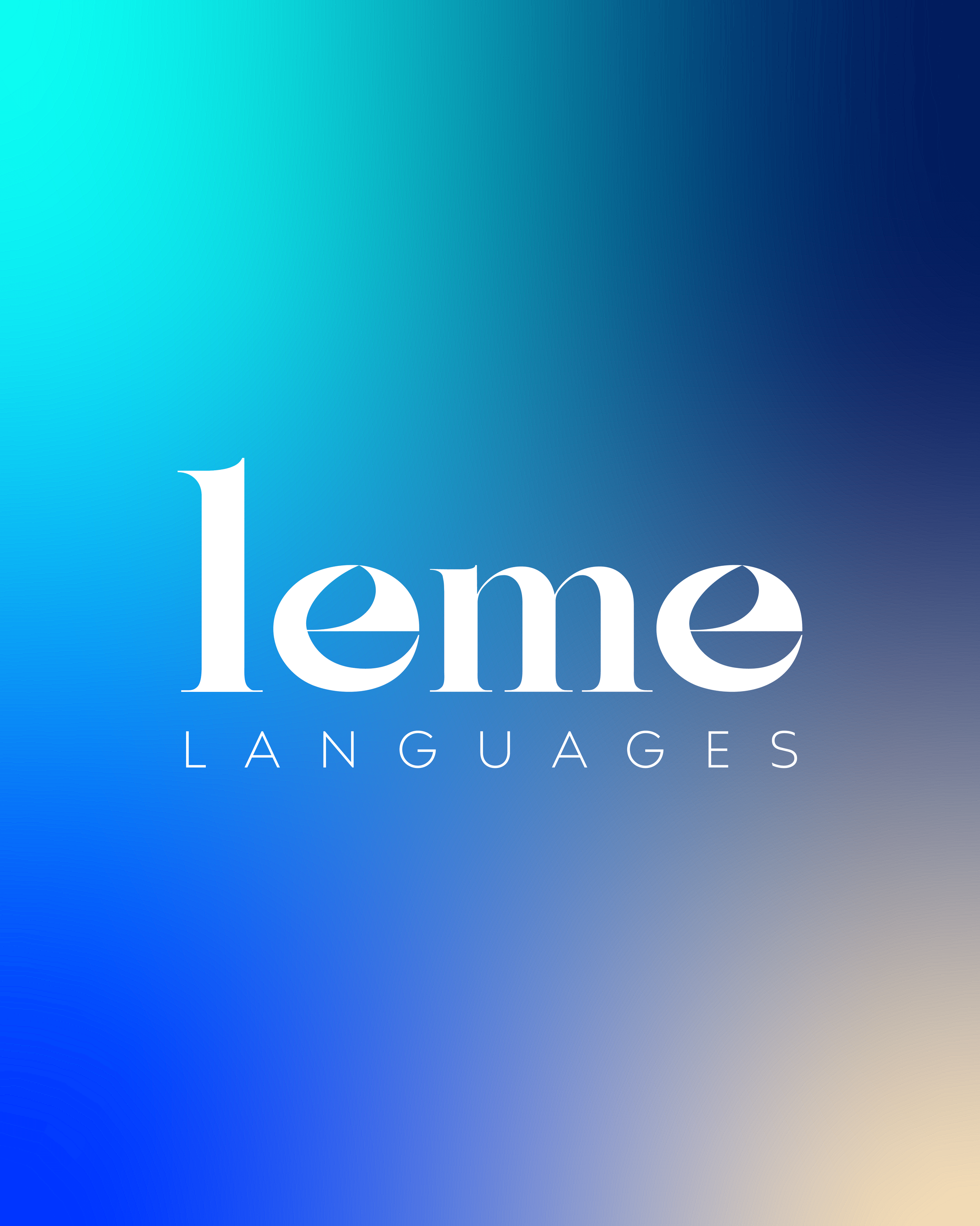
The name Leme comes from Portuguese and means rudder — the element responsible for guiding a boat in a steady direction. This concept sits at the core of the brand’s purpose: to guide clients through complex language processes with clarity, care, and confidence, helping them move forward smoothly across languages.
THE CHALLENGE
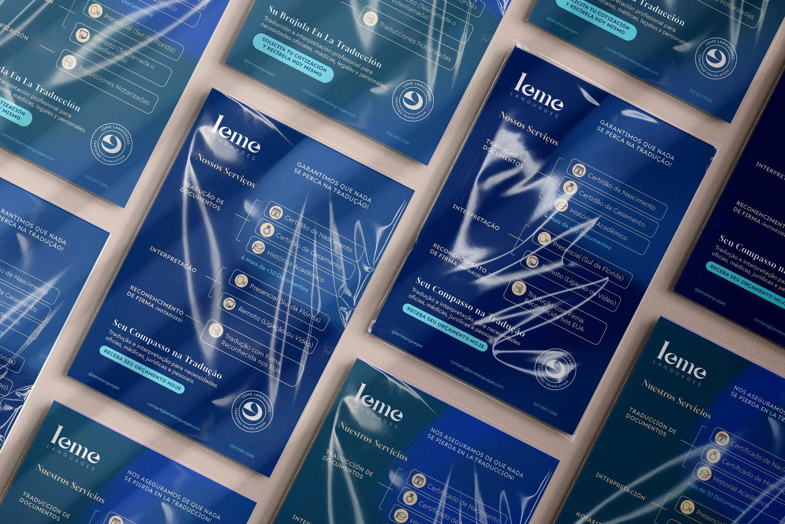
Leme Languages plays a responsible and sensitive role as a bridge between languages, cultures, and systems. While grounded in professionalism and precision, the brand is equally defined by warmth, empathy, and a human approach — values shaped directly by its founders’ experiences. With a youthful core and a modern mindset, Leme Languages needed a visual identity that felt light, authentic, and contemporary, making sure credibility was also a part of it.
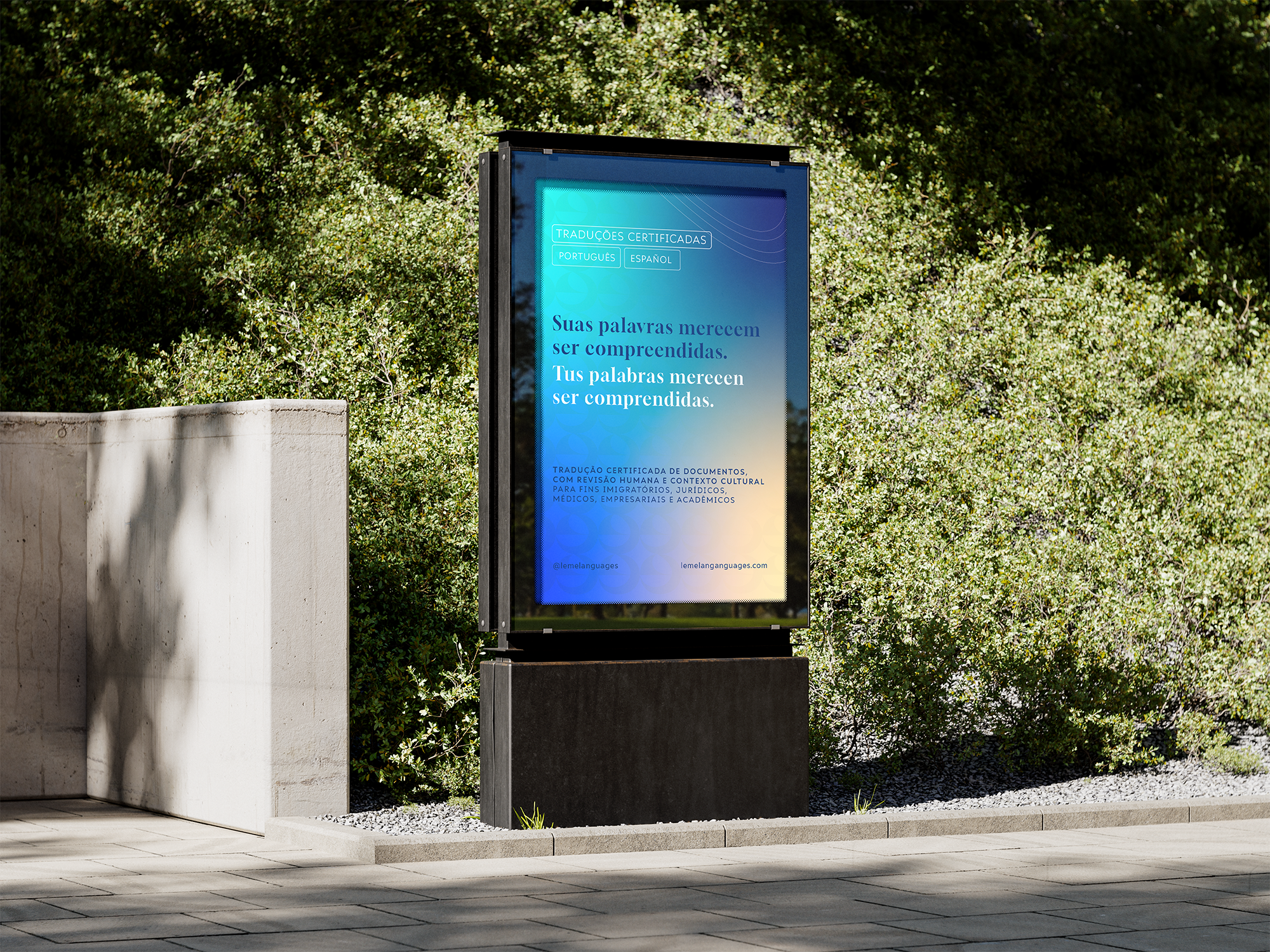
The challenge was to communicate trust, guidance, and cultural understanding without relying on obvious translation clichés such as speech bubbles, arrows, or generic language icons.
The brand needed to feel modern and intentional, communicating purpose subtly, not literally.
THE SOLUTION
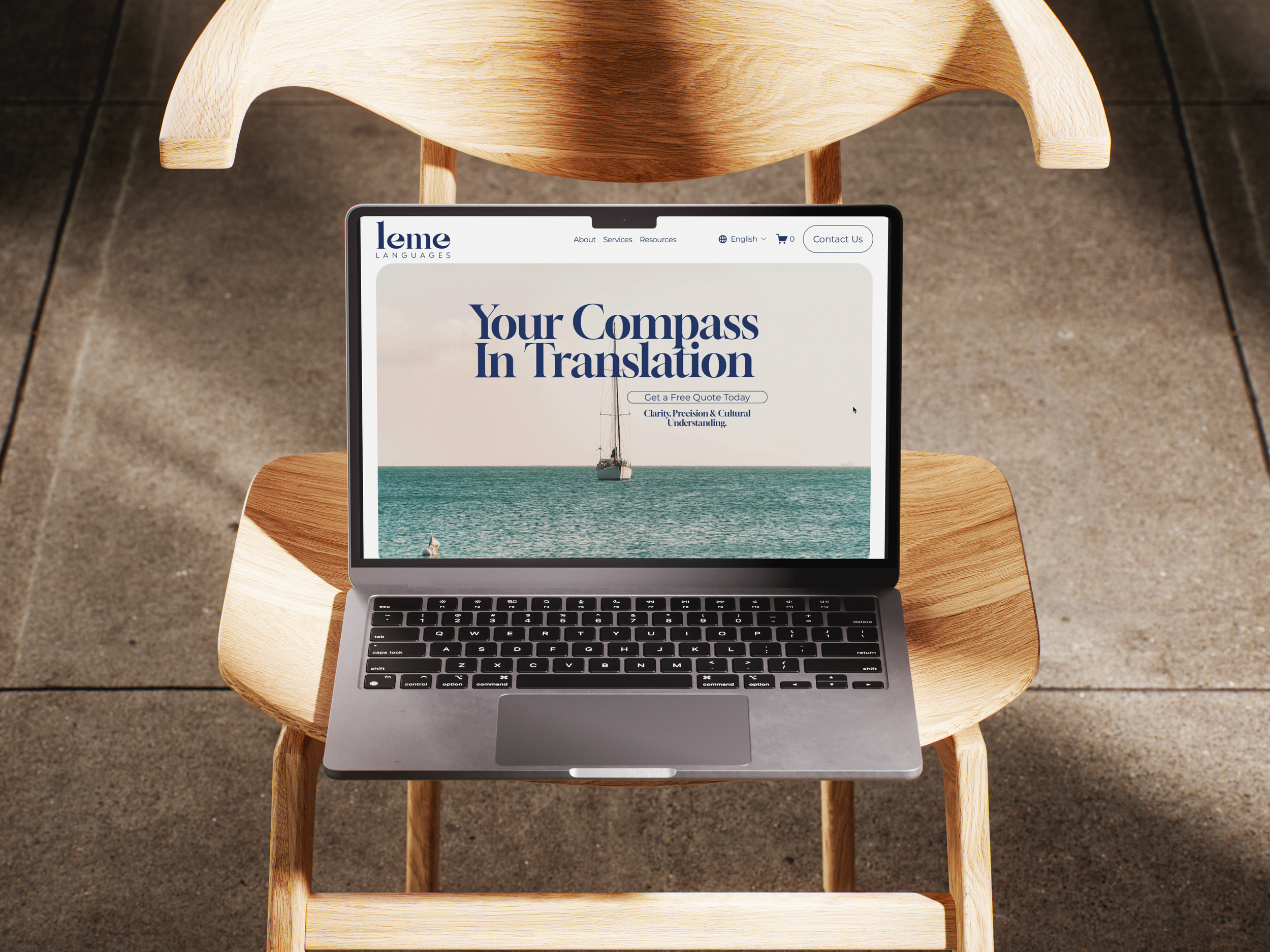
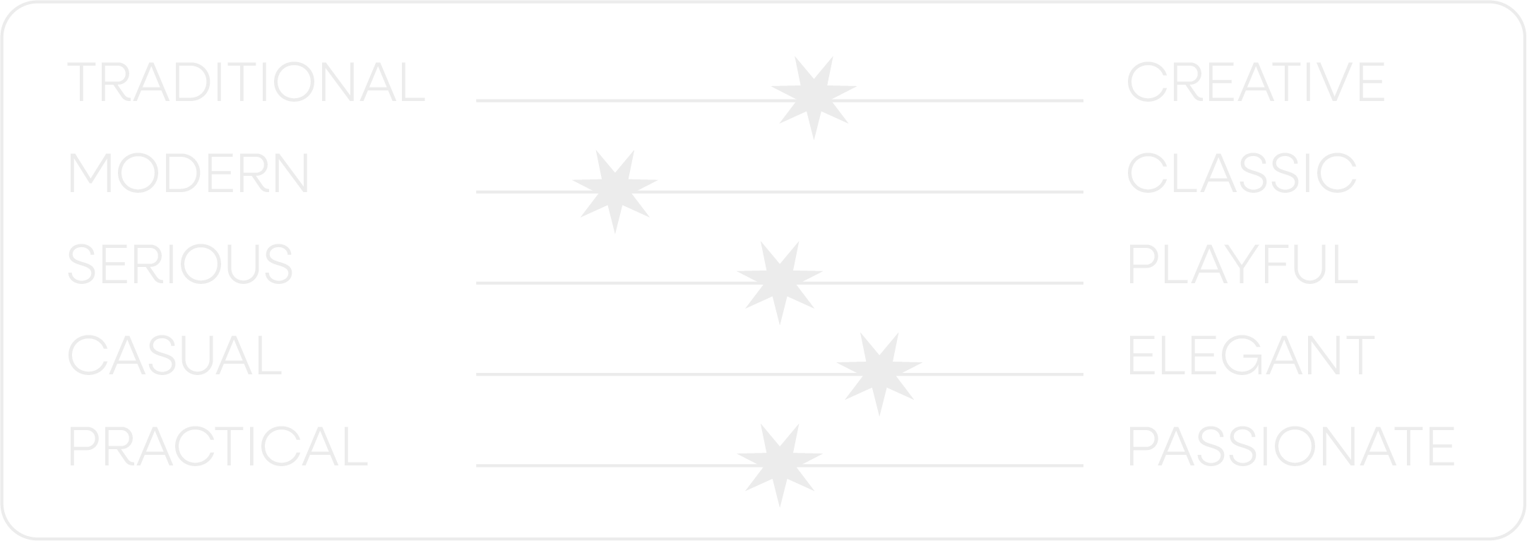
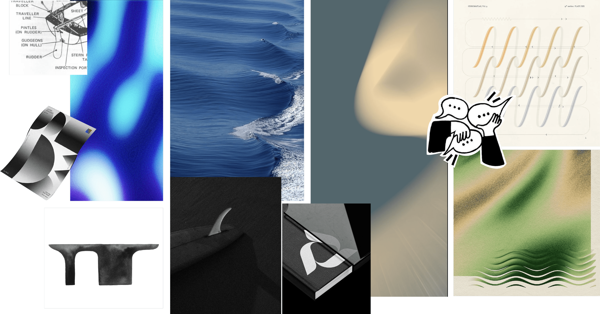
The solution began by anchoring the brand identity in its purpose: guiding clients in a steady direction for a smooth journey. With leme meaning rudder, its shape became the conceptual and visual starting point for the logotype design.
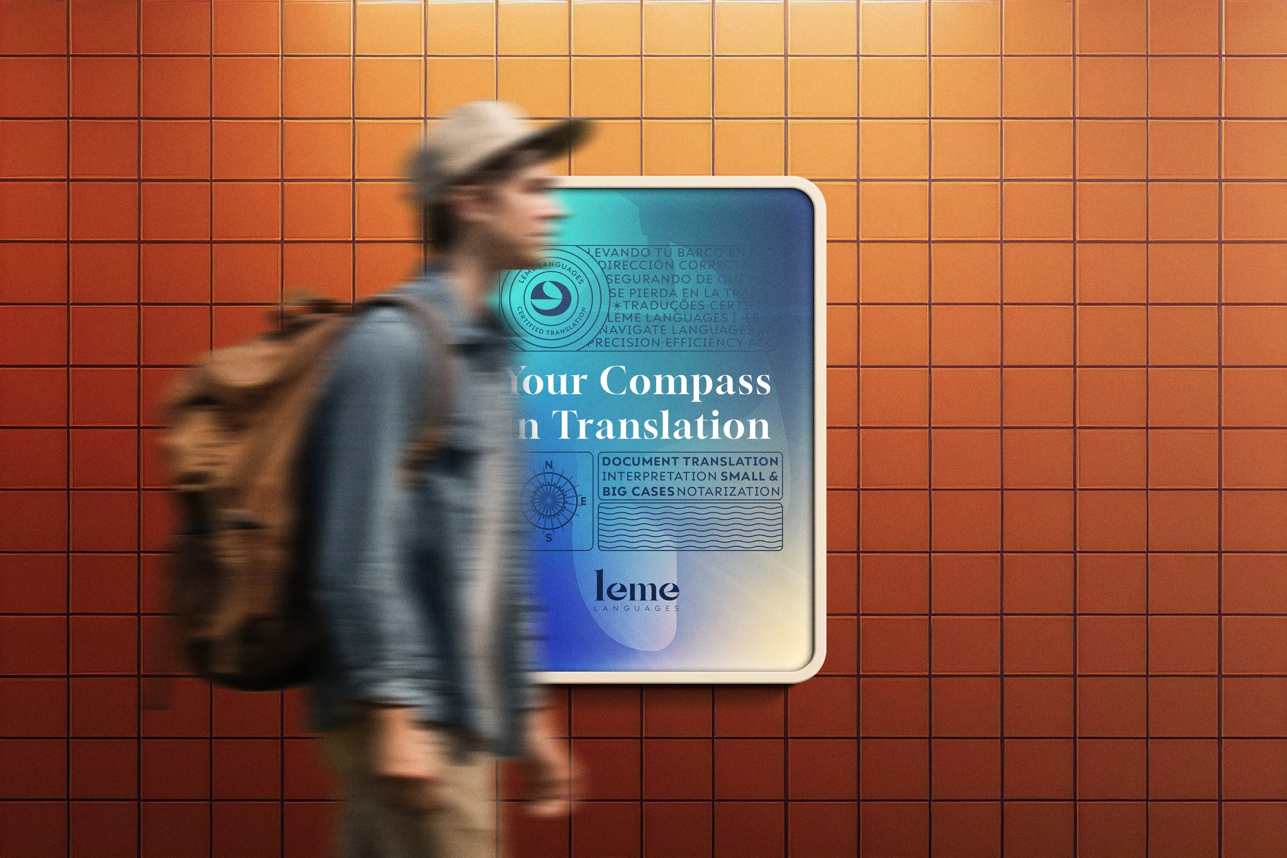
From there, the nautical approach emerged not as a decorative choice, but as the most precise and meaningful design direction. Calm seas, controlled movement, and boats navigating in a straight line became visual metaphors for reliability, guidance, and progress.
This language allowed the brand to feel modern, human, and confident: translating Leme Languages’ mission into a visual system that communicates trust and direction, without ever needing to say it out loud.
FINAL LOGO
LOGO VARIATIONS