
Pancrácio Consultoria & Contabilidade
Client: Pancrácio Consultoria & Contabilidade
Industry: Consulting & Professional Services
Services: Strategic branding | Social Media
THE STORY
Pancrácio Consultoria was built with the purpose of offering strategic and operational support in corporate management. Led by entrepreneur Iber Pancrácio, a manager with over 25 years of experience, Pancrácio Consultoria is a Brasília-based firm that combines expertise with administrative maturity. It positions itself as a strategic partner for businesses and organizations seeking efficiency and fiscal compliance in their operations.
THE CHALLENGE
The challenge was to create a visual identity that could express both the firmness and resilience clients can rely on, as well as the flexibility essential to the company's core value of temperance. How can firmness and flexibility be represented in a single element? And beyond the characteristics, how could the name “Pancrácio” and the symbolic strength it holds be faithfully translated into design?

THE SOLUTION

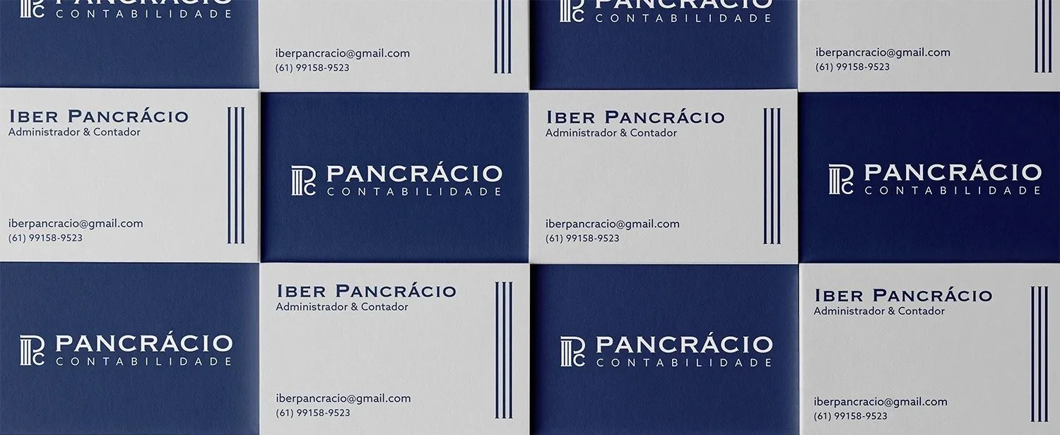
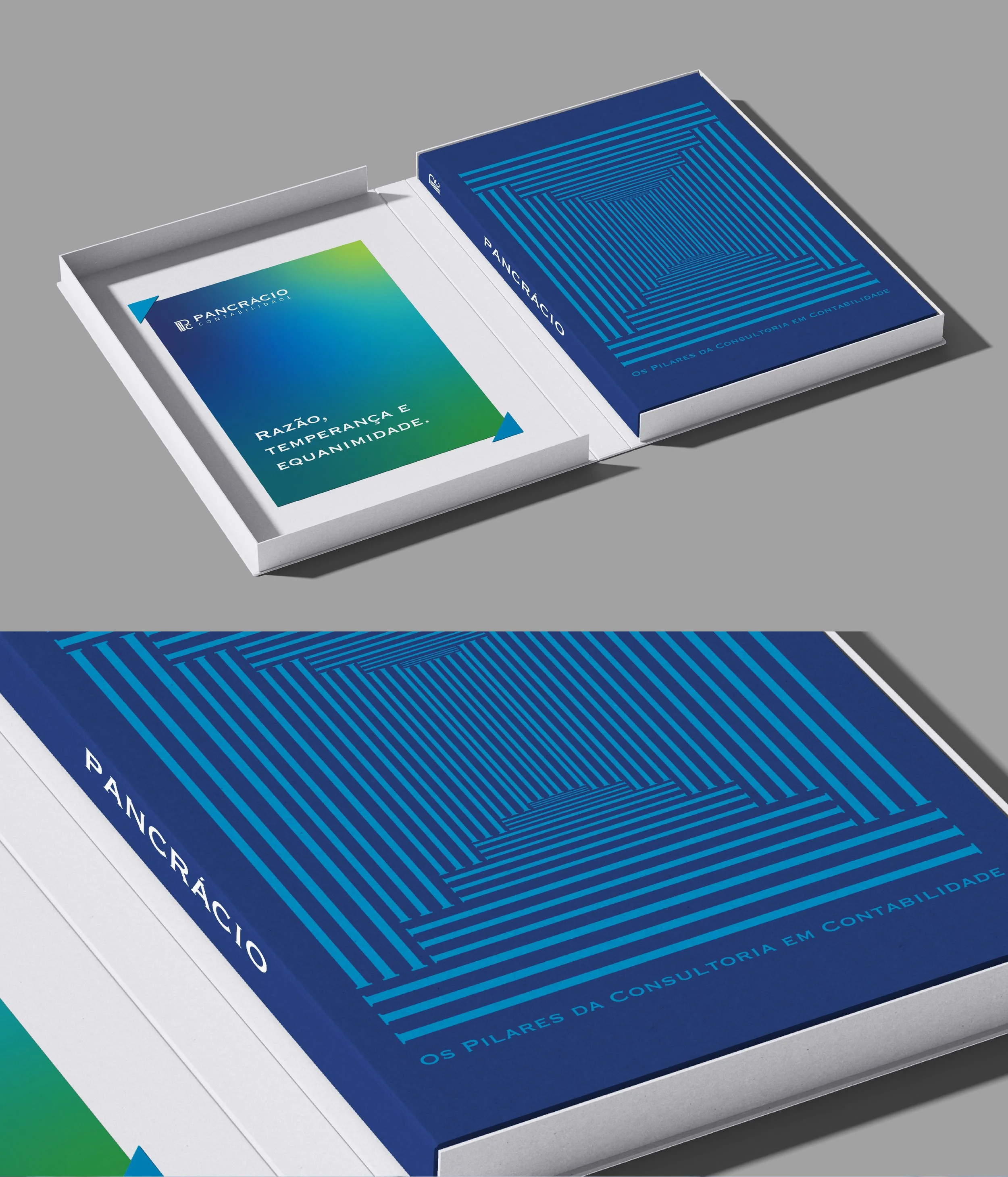
Rooted in the Greek origins of the name “Pancrácio,” we arrived at the concept of “entirely strong,” which led us to the symbolism of Greek columns — icons of strength for centuries. Beyond their structural power, columns are made of marble, a material known not only for its solidity but also for its flexibility and ability to be shaped.
Too much firmness becomes rigidity — and rigidity breaks. That’s why flexibility matters. The inspiration, then, was to use a typeface whose lines echo the form of columns, and a logo featuring the initials Pc, with curves that embody the brand’s essence of adaptability.